10 Tools for the Mobile Web

The constraints of ergonomics, adaptation and performance in the mobile Web world sometimes involve techniques rendered complex by the lack of specifications and existing tools at the present time.
Pending modules of positioning CSS flexible such as "Flexbox", or the stable specifications concerning the information of type "retina" or bandwidth of a terminal, we are forced to create ourselves our tools and strategies.
To make this easier, here is a selection of 10 resources.
The majority of the features presented in this article consist of biblioheques JavaScript and meet specific missions.
Needless to say that it is not recommended to use all of these tools on a single project, for obvious reasons of performance.
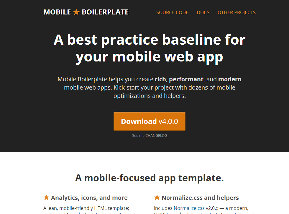
Mobile Boilerplate
Like the famous HTML5Boilerplate, his little brother "Mobile Boilerplate" consists of HTML, CSS and basic JavaScript kit to start with its mobile web site project.

320 and up
320 and up is a light framework dedicated to the "mobile-first" philosophy and automatically provided for the breaking of 480, 600 points, 768, 992 and 1382 pixels.
Flexible and scalable, it can be combined with Modernizr, Bootstrap, LESS and SASS according to your needs.
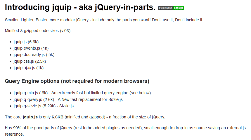
jQuip (shares in jQuery)
Shares in jQuery is a JavaScript designed framework to be lighter and quicker to jQuery and boasting to be compatible and to cover 90% of the features of jQuery. In the same vein, ZeptoJS is also a jQuery-light oriented mobile-first or even dedicated mobile sites (not support IE, for example).
Respond.js
Respond.js is a very lightweight and fast (alternative) polyfill allowing older versions of Internet Explorer (IE6 - IE8) to recognize the Media Queries CSS
min/max-width.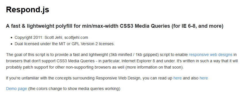
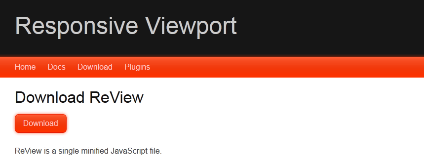
ReView
ReView or "Responsive Viewport" allows the user to move from a "mobile" view to a view 'office', and vice versa, by changing the values of the size of the browser window (viewport).
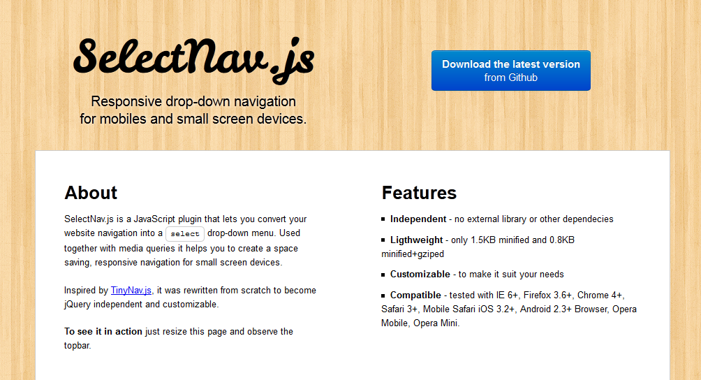
SelectNav
SelecNav.js is a tool to redefine the site navigation: on small screens, the initial navigation (list elements HTML) is transformed into HTML Select interface element, deemed to be ergonomically ideal mobile.
SelectNav is a stand-alone script. There are other tools of this type, such as TinyNav, but they often require a base jQuery.
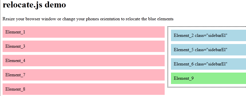
Relocate (and minwidth)
I mentioned in the introduction, CSS positioning magic such as Flexbox are not yet enough compatible for a massive use.
Relocate and minwidth are two scripts that compensating this lack:
- the first allows simply to move items from one container to another depending on the size of the window
- the second allows to do conditional loading JS script or other resources, also depending on the size of the window
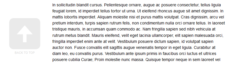
Animated scroll to top
This tutorial teaches you how to generate a button to return top of page animated way. This button is of course when you have scrolled. Note you will find a different version of this feature on the CreativeJuiz site (in french).
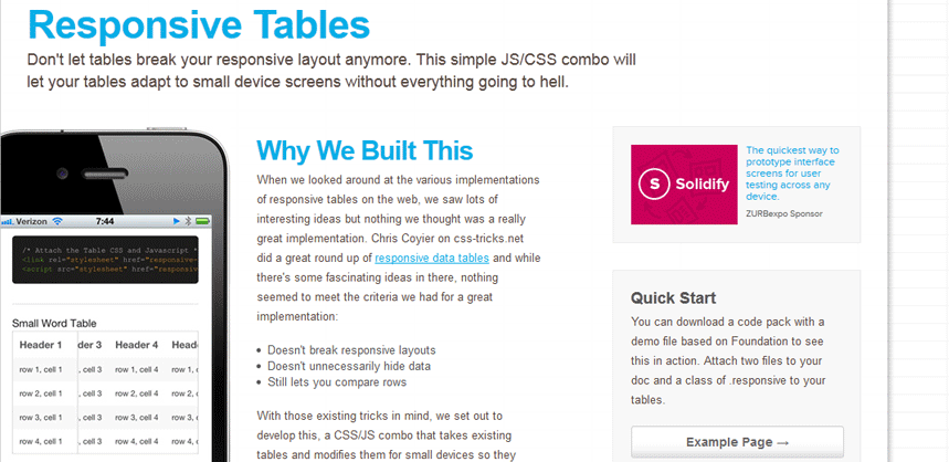
Responsive Tables
Zurb offers a guided demonstration of a solution to the thorny problem in Responsive Web Design: how to manage the data tables (complex)?
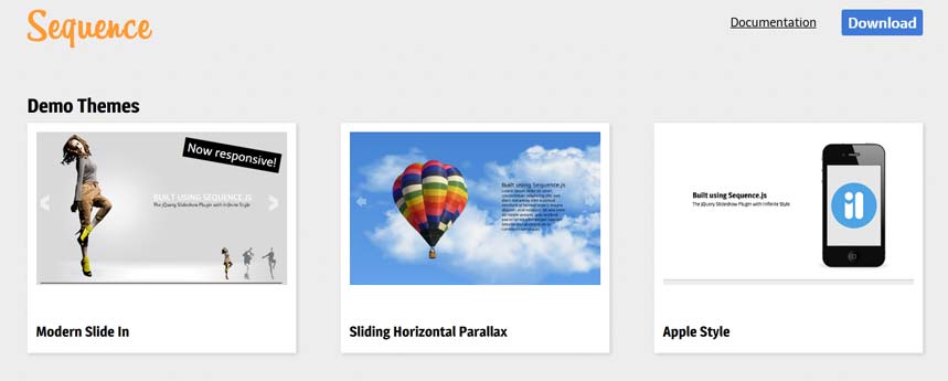
Sequence
Sequence.js is part of the many tools of sliders (or stuff) image responsive on the Net. He however has the particularity to be extremely comprehensive and offer three different display models very attractive.


Post a Comment